I could write a book just on covers so trying to cover everything is almost impossible.You can blame Stephanie Queen for this post because she suggested I do it. So love it or hate it, here I go!
My qualifications are minimal but I’ll give them to you. I’m an artist and I have taken gobs of  collage art classes. Why? Because they were fun and I never dreamed I’d need that info one day. I’ve also judged art, photography, and covers. (I’m showing off one of my pen and ink drawings, a favorite media and a favorite subject.)
Let me begin by saying covers are art. There are gazillions of paintings that I wouldn’t pay a penny to own, yet they are worth a fortune. There are a few things that others would consider just as repulsive, yet for some reason the wild color and vibrant splashes appeal to me.
So let’s start with the basics. Covers should send a message about what is between the pages. That info can be conveyed in a variety of ways. Let’s concentrate on romance genres in general.
We often see what I call naked people (minus shirts and more) covers. Amazon got wise to them and now many are tagged as adult novels, therefore separated from the average reader search. But authors didn’t like the censorship and being relegated to what they call the dungeon. To search the dungeon, the adult filters must be off. So many authors have cleaned up their covers and there are fewer naked people covers. The only clue to the reader about the heat level might be the word sensual romance in the description. To me, there are sensual romances and there are burning hot romances. But you’ll get the idea real fast if you read the sample. (Always read the sample before buying the book!)
Then there are the super clean romances and many covers contain the sweet innocent females often portrayed in costumes that belong to the Mennonites, Amish, or Brethren. Most artists don’t know the differences, and unfortunately, nor do the authors.
Suspense and thrillers – guns, chalk outlines of bodies, etc.
Fae – Look for the pointed ears.
Vampires – Look for the bloody mouth.
Shape Shifters – Look for the wolf or other animal on the cover.
Historical romances – Look for the women in period clothing.
Yes, what’s on the cover will often tell you what is inside. But I can think of two instances  where the covers were beautiful paintings and never gave a clue to the content. One is a very erotic book, and the other is a story that is just a historic romance. Personally, I tend to gravitate to those paintings and my historic westerns have “paintings” on the cover. The painted covers on my westerns are actually photographs that have been altered to look painted and the series contains the word historical. (This cover is is made from a photograph of Wyoming where my story takes place.)
So aside from a cover telling the reader what is inside, the cover needs to do several things. It needs to be visible as a thumbnail. What’s a thumbnail size? Think postage stamp or thumbprint. I’m an avid reader, but when I look at a ![]() cover in thumbnail size and I have no clue as to what is on that cover… That’s bad! Since several of my books are also available in print, the ebook version means the writing on them is not as clear in thumbnail. But overall, the cover is easy to comprehend in that small size.
cover in thumbnail size and I have no clue as to what is on that cover… That’s bad! Since several of my books are also available in print, the ebook version means the writing on them is not as clear in thumbnail. But overall, the cover is easy to comprehend in that small size.
Now here’s where it starts to get complicated. There are elements to covers that actually belong to marketing. It’s what I’m going to call gift wrapping. The vast majority of people can understand this example.
You spend forever picking out the perfect baby shower present for your niece. You buy that cute gift bag with the adorable baby blue, green and yellow print with a big teddy bear in the center, plus the blue and yellow tissue paper and extra fancy blue bow for it. Everything matches perfectly! The day of the shower you place the gift in the bag, add the bow, and the tissue paper. You stand back, look at your creation, and groan. It looks like your four-year-old child stuffed the bag. You take the tissue out and start over again. Now the tissue looks crumpled, and it’s lopsided. You grab several fresh sheets of tissue paper and try again. The results are the same as the first time. You give up and take the bag to the party. Your cousin Amanda shows up with the same bag. You groan again, but this time silently, and convince yourself that Amanda’s doesn’t look any better than yours. Tiana, your niece’s best friend shows up with the same gift bag. But instead of the mandatory blue paper, she has stuffed it in green and orange. Tiana’s gift bag looks spectacular! Why?
There are a few tricks to the tissue paper so that it doesn’t look quite as pitiful. (Lay it out flat, put your hand in the center and pick it up with your fingertips by dragging them together. Give what’s in your hand a slight twist, and if need be, hold that paper so it dangles down and give it a slight shake. This gives it that soft flowing “flower” shape that can now be tucked into a few places around the bag on the inside. If the paper had been folded, you can often iron it flat. Also consider buying more expensive, larger tissue paper which can be purchased by the sheet. (Check You Tube for creating pretty bags.) But let’s get back to eye appeal.
Tianna used contrasting colors for a bold look. Maybe the bag had a dash of these colors in the print, the bow on the teddy bear or some other little thing, or maybe Tianna just has a great eye for picking contrasting colors off the color wheel and that’s a little tougher to do. But chances are Tianna saw that added dash of color in the print and used it. She paired it with the soft green, using the green as a neutral color, which allowed the orange to pop next to it. And instead of the traditional bow, she used a ringlet bow that falls almost to the bottom of the bag. Bet you never paid attention to that orange bow on that teddy bear when you bought the bag, but now you see it with that orange, yellow, and green bow dangling off to the side of the teddy bear. But what she has done is created an eye sweep of the bag. The bright color captures your eye and drags your gaze over the bag.
All those soft colors on your bag run together giving your eyes no specific focus. Chances are your bag looks lovely in a traditional/classic way. And I promise we are much harder on ourselves when it comes to things like that. I’m willing to bet that your niece would be just as thrilled with your gift if it had been wrapped in the Sunday comics.
But a gift is not a cover! A cover must entice unknown people to buy the book. We’ve all been taught not to judge a book by its cover. I have no clue how that notion got started, but I wonder if it started with books years ago.
What is called dust jackets, those paper covers that wrap a hardback book, became the first real pieces of book advertisements. And I’m certain that is what started the whole cover trend. Sometime in the early 1900’s, hard bounds began to contain a paper color plate (a printed picture) that was glued onto the front of a book. Usually the dust jacket also contained the same picture. I grew up reading hard bound books that had been bound with cloth covered, cardboard-like bindings. Those jackets drove me nuts! They slip and side, they’d get worn and tear, or the edges would curl. That inner folded piece that “held” the jacket to the book was called a fly. It often contained a blurb-like spiel on the front fly and maybe something about the author on the back fly. It had one purpose as far I was I was concerned – it was an attached bookmark. If I could get away with it, I ditched that book cover and read the book without it. (I can still hear my mother complaining that I had removed it! And probably misplaced it.)
But what I often had when I removed the dust jacket was a plain cover. Sometimes the title was stamped but most of the time, it was only found on the spine. So instead of a fancy paper cover, I was staring at a plain beige, blue, burgundy, brown, or green hardbound cover. There was nothing about it that said read me! The title was all anyone knew about that book. No flies to tell me anything, just a plain book. But considering I had older siblings and apparently one of them was just as bad about losing covers… I learned quickly not to judge a book by its cover because the pages between that bare beige cover might have the most exciting book I had ever read.
But today we are spoiled. Can you imagine walking into a Barnes and Noble where all the covers were plain? Or trying to find an ebook on Amazon that had nothing but a plain covers? Covers must appeal to our eyes. So even the most thrilling thriller must have eye appeal. And forcing the eyes to cover the entire cover requires a few tricks to the trade. Eye sweeps! The “Z” is the most common sweep. The eye flows across the top from left to right then catty-cornered to the next left to right sweep. That is our normal pattern for reading. We read one line at the top and then zip down and across to the next line. A mirrored “Z” (or a backwards Z ) will also work for a cover. A “C” is the next most common sweep and the C can also be reversed. Remember this is from top to bottom! Always start at the top! And lastly, it’s plain but works, is the straight line or what is called an “I“.
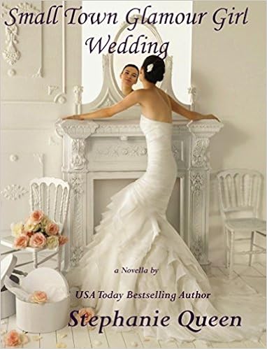
So let’s look at these sweeps on real covers. This one belongs to Stephanie.
I did a fast search on Amazon and this one popped up first.

It is the perfect example of an “I”. Here it’s the yellow background that creates the sweep. The yellow is in the sky, down the surfboard and into the sand that’s reflecting the sunrise. The sweep is punctuated by vibrant blue and hot pink. It forces the eyes to read straight down the page. If you are familiar with Stephanie’s series, you know it’s going to be a fun exciting read. This is the perfect book to read on your beach vacation. Don’t you agree?
Here’s another one of Stephanie’s covers and I personally love, love, love this cover It’s an example of a “Z” but it’s subtle and somewhat modified.
This is really a multi-color sweep but it works! The writing is a dark purple. (Yes. it’s a red/blue on the color chart.) Do you see the “Z” ? It goes across with the writing of the title and it sweeps with her stance in that dress to the hatbox and then across with Stephanie’s name. (Down her back, to her butt, across to the hatbox, and then follow the hem across the train.) And let’s face it, that white Victorian room is to die for! Add a beautiful woman in a fishtail wedding dress and what is there not to like? I want that room! (And I used to be slender like that! Those were the days.) Look hard at the bottom sweep. That single rose by her hem forces the sweep across Stephanie’s name. The monochrome color scheme makes the words and the bride pop. And if the title and Stephanie’s name had been in black it would have been too harsh against all that soft white. It’s a great cover!
This one is Jill James book but I like it for the sweep of the “C” and there is a slanted “I” also in it. Do you see them? The “I” goes from the top left to the bottom right.
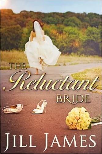
At the very top left corner there is a sun and that yellow from the sun is echoed in the trees, the title, and ends in the bouquet, creating that slanted (top left to bottom right) “I”. The “C” is formed in the white, her dress, her shoes, and Jill’s name. I think we’ve all known brides who have either bailed or wish they had! Probably more that wished they had.
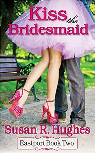
This is Susan’s and it’s a “Z” do you see it? Follow the pink, across the top, the legs point to the shoes, and then her name. The dress and shoes tell you this is going to be a cute story.
This one is also Susan’s.
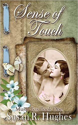
There’s an I and two Z’s in this. The I is in the blue ribbon. The cover is very classy with it’s subtle colors. It also matches the historical story which is sweet and yet has a sexy component to it. The “Z’s” are green and the other is a reverse “Z” in brown, again very subtle. I loved this story, which kicked off this particular series.
This one is Mona’s. Can you tell me what the eye sweep is? There are actually two.

Did you guess an I for the Eiffel Tower? But do you see the green? It creates a “C”. This cover says it’s contemporary romance in Paris. Are you catching the height of that gal’s heels? Wow!
Cannibalized covers usually don’t quite work, and I suggest that people don’t use them. There are a few, and only a very few, cover artists who can manipulate photos of people and make gorgeous covers. They can take a gal in a pencil skirt and when they are done, she’s wearing a medieval dress. Making those sort of changes to a picture are not impossible. There are classes on photo manipulation and You Tube videos on how-to. But doing it well, take real talent!
I saw a book cover, and my first glance told me it had been manipulated. It bothered me. I saw the cover several times, and each time, I was struck by that something-is-wrong-with-this-picture feeling. To make matters worse the cover artist used the elements from the cover to design a website header for this author so every time I visited the blog, it was there. One evening I took a few minutes and looked hard at that cover. Yikes! The dress was painted onto the gal’s skin. The head was too small for the body and her hand was child-sized near her face. The added head was camouflaged with a shadow. The hero stood by the heroine and the light hitting his face was different from the light on the heroine.
Another cover showed a gal looking over her shoulder. Um, no one can move their head that far around on their neck. She is not an owl! A recent cover showed a gal in an elaborate hat, except the gal had no hair to go with that hat. The light was striking her dress one way, but her face was being struck from a different direction. Adding a bouquet of roses into a picture is one thing, but switching heads, and moving arms and legs is often another. There’s a cover where the gal is being held in a passionate embrace, but when you look carefully, her feet are off the ground. If you pick up someone, their toes drop slightly or a whole bunch, but this gal has her feet firmly planted on an invisible step.
Then there are the bad breath covers. It can be him or her, with his or her head turned away from the other person as though the breath was enough to cook a maggot. I’m not sure what that says about the story. Is one of them reluctant to marry? Or does one of them need to see a dentist or stop eating that much garlic?
Yes, I realize that many who write or read historic romances, it’s really all about the dresses. I’ve seen these authors being thrilled with a poor cannibalized cover, because the dress was pretty. I want to scream no! Tell them to make that cover artist fix it. But they only see the long flowing dress and not the the errors.
Changing the color of a car or a dress is not difficult with today’s software. Changing hair color is tricky but doable. But I’ve seen some horrendous hair jobs. The change is made in the area where you will find things such as hue, saturation, etc. I actually changed the eye color for a friend’s cover. She had the perfect cover stock, except the gal had brown eyes and this heroine was supposed to have striking blue eyes. So back then, I changed the eye color pixel by pixel. The average cover artist will not take that sort of time to make such a change. But the finished product – the cover is fabulous. (Patting myself on the back.)
Yes, things can be done well. But many are not. There’s one cover artist that I must admit that I truly admire, for she can change a gal’s dress and I have seen her do it. But honestly, I can’t imagine ever doing it myself. But no matter what, a cover must be striking. It must capture the eyes and hold them. One of my favorite whodunit authors has a wonderful cover artist and each of her covers will grab your attention, even if ultimately they don’t appeal , they will still grab you. I can walk into any bookstore and tell from a distance that it’s her book. That is branding and branding takes on a life of its own.


If you are cozy mystery reader who loves yummy good recipes, reading the Hannah Swensen mysteries is…well…fattening! (Forgive me, Joanne, but reading these recipes are dangerous for anyone who is watching the scale. I think I gain five pounds just reading.) But I promise the stories are delicious and the recipes are easy! And Joanne Fluke is a real sweetheart of a person.
And what is the eye sweep on both these covers? If you guessed straight down, in an “I”, you are correct.
Branding a cover isn’t easy, but once it’s branded, watch out! My River City books are branded with sky line. I’ve grown to hate the skyline. It was a great idea at the time, but now I have to live with it. Unfortunately it didn’t work with a few pieces of stock that I would have liked to have used, but couldn’t because it clashed with that skyline. I’ve talked to quite a few people about changing and they all say, “NO!”
It’s my brand and it’s very recognizable. I’m stuck with it. Beware, if you read my westerns and then read these – there’s a lot more heat in these novels! I might have another coming out the beginning of 2017. They won’t melt your Kindle, but they are not tame!
Branding is something that makes a cover belong to that author. It’s supposed to be distinctive. We create brands in our lives all the time. My daughter is an artist and it wouldn’t matter if she stripped everything off her walls, repainted, bought new furniture, etc. When she was done, it would still be that modern house with her distinctive “look”. Peeling me out of my jeans is almost impossible and that is reflected in my home, which is filled with old fashioned furniture, and things like lamps made out of bitty feeders, horseshoes, stirrups, ceramic or metal chickens, goats, lambs, etc. Okay, yes, it sounds crazy, but it’s me. I’ve branded where I live and I bet you have, too!
That same brand ing is applied to books. It’s something that says this is this author and only this author!
Also covers fall into two basic categories. There are icon covers. Joanne Flukes are covers are icon covers. Then there are “photos” of people, landscapes, etc. But a photo of a icon is still an icon. A simple picture of a glass or a single rose is an icon cover. There’s also something that is a called a step-back cover. This is a layered cover. You might have a gal in a beautiful dress in the foreground, and behind her is a muted sailing ship on the high seas or maybe a castle. Step-backs can also be done with icons. You might have that couple in the background and a ship’s wheel in the foreground. I’ve seen beautiful step-backs and some terrible ones, but when they are done right, they are awesome.
So covers are really a series of elements. Most people have no clue as to why, but certain things appeal to them. They probably couldn’t tell you why they like Rembrandt and dislike Monet. There’s no right or wrong. But understanding why a certain cover appeals could be as simple as discovering that the eye sweep of a “C” is less appealing to that person then a simple “Z”. Or they dislike yellow. So no matter how beautiful that gal is in her yellow dress, someone won’t read it because she’s wearing a yellow dress.
Am I critical of covers? Yes! Do I like all of mine? No. But because of my art background, I see what others fail to see. That cover where the gal has a sword resting over her shoulder. Yikes! That heavy blade is razor sharp and its sharp edge is against her shoulder and running through her hair! She’s going to have a few long locks missing and nasty scar where the blade bit into her skin. And in all honesty, the smaller pubs and indies don’t have the money like the big NY publishers to have photo shoots to create the perfect cover for their books. Instead cover artists and indies search sites with stock photos that can be used. And many times the covers are terrible. And don’t just blame indies for lousy covers. Yes there are some horrible ones coming out of small pubs.
There are websites devoted to finding horrible covers. And some of those covers are laughable. Especially where someone wants something stuck into the cover so they “poke” a hole in the cover and insert a face. I’m talking about the landscape with a decapitated head in the picture. I’m not talking about the ethereal image tucked beautifully into the clouds. It’s as though someone just cut a hole in the picture and pasted another image into it. There are good ways to add elements into a picture and really horrible attempts. If you can’t do it, hire someone who can!
We’re not supposed to judge a book by its cover, but we all know that’s exactly what we do. How many of us have bought a book because the cover was so darn cute or so pretty! You want to read a cowboy book or maybe a sailing story, and there in the mix of books is this really adorable guy. It’s true, don’t deny it, you’ve always had a thing for a guy with a goatee or you just love a hunky redhead. Yep, you grabbed that book! (And you didn’t read the sample. Shame on you. You just bought a pig in a poke.) I’m a sucker for an antebellum on a “painted” cover listed under historical. And tall, dark, and handsome, will make me look twice. But super-sized muscles is an instant turn-off for me and those muscles usually grab most women!
So you’ll never appeal to all readers, but make certain your cover is eye-catching. It has a good eye sweep, it depicts what is between the pages, it says you wrote it, and if it’s part of series, that series is obvi ous. Most of all, be certain your artist didn’t make a mess of things. Look very carefully at the picture. If you are unsure, ask your friends. Not everyone will see the flaws, but someone is apt to find them if they exist. Never accept second best from a cover artist. If need be, pay the artist for his or her time and find another one. (Pay them! They put time into it! If you were working and your boss didn’t like what you did, you’d be furious if he or she said, I’m not going to pay you for the last 120 hours because I don’t like what you produced!)
It’s your book, and your name will go on that cover. Be certain it’s saying what you want it to say, not just about the book but about you. Don’t put the Norfolk skyline on a book that takes place in Seattle. The book reflects the author. Blow the cover and you’ll probably blow a ton of sales! Why? Because like it or not, covers sell books!
Any questions?

Wow, I’m so flattered that you used my covers as examples. Great information.
LikeLiked by 4 people
You have some lovely covers. But you also have terrific stories that are well written! The covers on your Music Box series are so well branded with those old-fashioned frames that they are easy to spot.
LikeLiked by 1 person
Thank you so much for using my cover. I love that one! Vanessa Kelly has the most amazing historical romance covers. I would buy them just for the covers even if I didn’t know Vanessa and know her stories are awesomesauce!! Thank for all that info. I will be looking differently at covers from now on.
LikeLiked by 3 people
I had to look Vanessa Kelly up on Amazon. Yes, beautiful covers!!! She’s also lucky enough to have a major publisher producing them! I think a lot of those writing for the big boys fill out an extensive cover sheet so the artist has a strong profile before he or she begins. But even small pubs do that and frequently still produce “bad” covers.I know of several people who have been in tears over lousy covers. The big companies have ditched quite a few editors because they expect the story to be well edited before they get it, but they have kept their cover artists!
LikeLiked by 1 person
Wow…very informative. I hope I never get into the bad cover areas!
LikeLiked by 3 people
I’ve seen a ton of bad covers from the sci-fi folks and I’m not sure why. But when a genre or an author gets a reputation for bad covers, it really hurts. Most of the sci-fi authors create elaborate worlds with strong storylines and then they are given a lousy cover… Oh my! It’s a shame.
Remember to keep the covers simple, and be super positive that you LOVE the cover and it fits the story. Dig into the cover and be certain it really is perfect and not flawed.
🙂
LikeLiked by 1 person
Great post. Now l have to go check out all my book covers
LikeLiked by 3 people
Thanks Judy, for stopping by. I’d love for you to come back and tell us what you found on your covers.
LikeLiked by 1 person
Thanks for a very interesting post, a real study of book covers by a real artist. From now on I am going to study the book covers carefully, and try to find the Z or C or I. Most of my book covers are made by EarthCharms. But I made some mistakes ft hem myself, like the one you use here, Her French. Count. I use a program called Roxio. I was never able to learn to use Pthotoshop and the advanced one is too expensive.
LikeLiked by 2 people
Typos: it should read: I made some myself.
LikeLiked by 2 people
If you made that one, you did well. The power in the newer versions of Photoshop is beyond what most of us will ever need. I probably don’t use a tenth of what it can do, and I consider myself to be a strong, frequent user. There are plenty of inexpensive and free programs that are excellent for the average person. And if you wanted to step back in time to when the Tower was first built and have that couple in period clothing, you would find stock with the couple dressed accordingly. Because changing clothing is an art in itself!
🙂
LikeLiked by 2 people
A most excellent perspective on cover art. Thank you.
The Cover Goddess has been good to me. I love all my cover art. Although, I’m sure others wouldn’t.
I recently tried my hand at creating cover art, but the learning curve is too steep for the results I wanted, and I just don’t have the time/energy right now to learn. Although, I will say I like what I did create, and will keep experimenting until my cover artist has time to do mine.
LikeLiked by 3 people
Thanks for stopping, Savanna. The more you play, the more you learn. Keeping things simple is usually best. Repeating colors and good eye sweeps will make the cover appealing for most people.
LikeLiked by 2 people
Excellent information on creating covers, E. I’d love to learn to make my own covers, but until then, I’ll leave covers to the professionals! Thanks for a great post. 🙂
LikeLiked by 2 people
Even authors who are buying covers, or being assigned and working with cover artists, need to know a little something about covers so that they actually get good covers.
🙂
LikeLiked by 1 person
I agree!
LikeLiked by 1 person
Pingback: What Makes A Good Gover? | Helen Henderson, Author
Thank you for the informative and applicable article. I love reading a post that adds to my knowledge as an aspiring author. Your points are specific and now I’m beginning to see “C”, “Z”, and “I” covers as I look at books. These tips will help me when I hire someone to make my covers.
LikeLiked by 3 people
The trick is for your eyes to sweep the page!
LikeLike
Very informative and thorough – thank you so much for the insights!
LikeLiked by 1 person
Well, it’s your fault! 🙂
LikeLike
E. Fascinating article although I’m such a non-visual person I didn’t get any of your quizzes right! I still love your covers (and yes, the skyline)! Hope we do move away from the naked (shaved) chest covers—I always begged for silhouettes instead. Now: can you do a cover for me? 🙂 Meredith
LikeLiked by 1 person
Thanks for stopping! Oh, yes, the little boys with no hair on their chests and muscles that make them look as though they’ve been on steroids. What ever happened to real men who know how to wear their jeans?
LikeLike